

Modernism means freedom - freedom to mix, to choose, to change, to embrace the new but hold fast to what is good. - Edward Wormley
Wednesday, February 22, 2012
Pink and Yellow
Check out Diane von Furstenburg’s tableware collection that reflects the same bold aesthetic as her world famous fashion collections. Pink and yellow is going to be the killer color combination this summer.
mydeco.com
mydeco.com is an online 3d room design program. It's actually really cool. There are options to design with furniture already selected or you can design an empty space. There are some great ideas on the site, and if you don't use or have rivet, it's another way to put together a killer room.
Here are a few more designing mantras of mine.
• small spaces were created to challenge us
• dimmer switches will triple your chance of romance at home
• shopping in your PJ’s with a refreshing beverage is fulfilling
• your home says more about you than your iPod
• the guy next door is as inspiring as glossy magazines
• mixing and matching Granny’s knick-knacks with design classics
• if you love it, it doesn't matter where you bought it
Wednesday, December 21, 2011
Color Trend 2012
This was published a few weeks ago by Trend Bible, an awesome blog that is great about following trends in the interior design industry.
Coming up in 2012 it looks like a blend of neons and pastels for a bold color palette.
 Earlier this month we attended the Crown Paints press day to see the results of our collaboration with the Crown Trend Panel to create paint palette concepts for Spring / Summer 2012.
  Each year Crown invite a group of colourists from diverse industries to join them for lively discussion and to define the trends that will inform the design landscape for the year ahead. The event, held at the Swarovski Crystalized Lounge, London, showcased four colour palettes; New Directions, Summer Jewels, Surreal Botanical, Modern Nostalgia.
 The stunning styling in the forthcoming summer colour brochure is by Living Etc Style Director, Harriet Patterson.
  ”One of the key concepts I was keen to get across for emulsions ws about thinking beyond traditional colour groupings like ‘pastels’ or ‘brights’ or ‘neons’ or ‘neutrals’,” explains Trend Bible director Joanna Feeley. “So the strongest palette for me was New Directions, which cleverly blends pastel shades with bubblegum pink and acidic chlorophyl brights. Grey still underpins strong colour and we see grey as being a key backdrop to brights through 2012.”
“The consumer is increasingly sophisticated with colour in the home, and I think we’ll see a return to clever colour combinations expressed through paint replacing our obsession with wallpaper, which can give the desired effect in terms of drama and personality in the home, yet is more permanent and harder to update than paint.” said Joanna. “The ongoing post-recessional mood means homeowners will be staying put instead of moving house, encouraging them to think cleverly about creating more space, more storage and a unique hard-wearing yet characterful style at home.”
Coming up in 2012 it looks like a blend of neons and pastels for a bold color palette.
Colour Trends: Crown Paints 2012 Colour Panel
Earlier this month we attended the Crown Paints press day to see the results of our collaboration with the Crown Trend Panel to create paint palette concepts for Spring / Summer 2012. Each year Crown invite a group of colourists from diverse industries to join them for lively discussion and to define the trends that will inform the design landscape for the year ahead. The event, held at the Swarovski Crystalized Lounge, London, showcased four colour palettes; New Directions, Summer Jewels, Surreal Botanical, Modern Nostalgia.The stunning styling in the forthcoming summer colour brochure is by Living Etc Style Director, Harriet Patterson. ”One of the key concepts I was keen to get across for emulsions ws about thinking beyond traditional colour groupings like ‘pastels’ or ‘brights’ or ‘neons’ or ‘neutrals’,” explains Trend Bible director Joanna Feeley. “So the strongest palette for me was New Directions, which cleverly blends pastel shades with bubblegum pink and acidic chlorophyl brights. Grey still underpins strong colour and we see grey as being a key backdrop to brights through 2012.”“The consumer is increasingly sophisticated with colour in the home, and I think we’ll see a return to clever colour combinations expressed through paint replacing our obsession with wallpaper, which can give the desired effect in terms of drama and personality in the home, yet is more permanent and harder to update than paint.” said Joanna. “The ongoing post-recessional mood means homeowners will be staying put instead of moving house, encouraging them to think cleverly about creating more space, more storage and a unique hard-wearing yet characterful style at home.”
Thursday, December 8, 2011
Carte Blanche
I am designing a master bedroom for a single elderly gentleman... though I don't know that he would like me to be calling him elderly. But since he is older than my dad, he falls into that category in me book. He's a great guy though, and is giving me a really exciting project. I don't have many boundaries on this one, he just wants it to look good. He says he's a chamillion - he can blend in with anything so there is no reason to try to make it look like something that he would want. Make it stylish. I did get him pinned down to something more modern. He has some sentimental furniture, but then again, everything is sentimental in the house - one of the reasons for bringing me in was to break through the sentiment. The furniture can stay or it will go to his children. A real Carte Blanche. In a lot of ways this is really cool in other ways.... some direction/feedback please?
These are a few ideas that I have come across that I think would be appropriate for a client's bedroom.
I am leaning toward neutrals/browns with bold patterns in accent. We discussed keeping the existing furniture so I began designing with that in mind. However, I feel that the furniture that the client has now is more traditional and has more feminine curved lines than what we discussed for the overall desired look. Since the client is wanting a modern, masculine feel I have suggested that new furniture be brought in. I have suggested that the senitmental furniture be used in a guest room, and the client seems pleased with this alternative. Below I have included some concept photos, Renderings will be comings soon and photes when the project is complete. These pictures definately need an accent color, I am leaning toward red and/or gold, there are some middle eastern artifacts that the client has requested to be included in the decor.


Tuesday, November 8, 2011
Some Library Designs
I love books. I love to read them and I love to look at them. I especially love a well designed library. Even if you don't have space in your home for a specific library room, it is possible to give your favorite books a distinct place in your home.
I love the bookcase built around a fireplace look, it reminds me of Disney's "Beauty and the Beast" in that the focus of the room is dominated by one wall. I think it lends itself well the many different design styles.

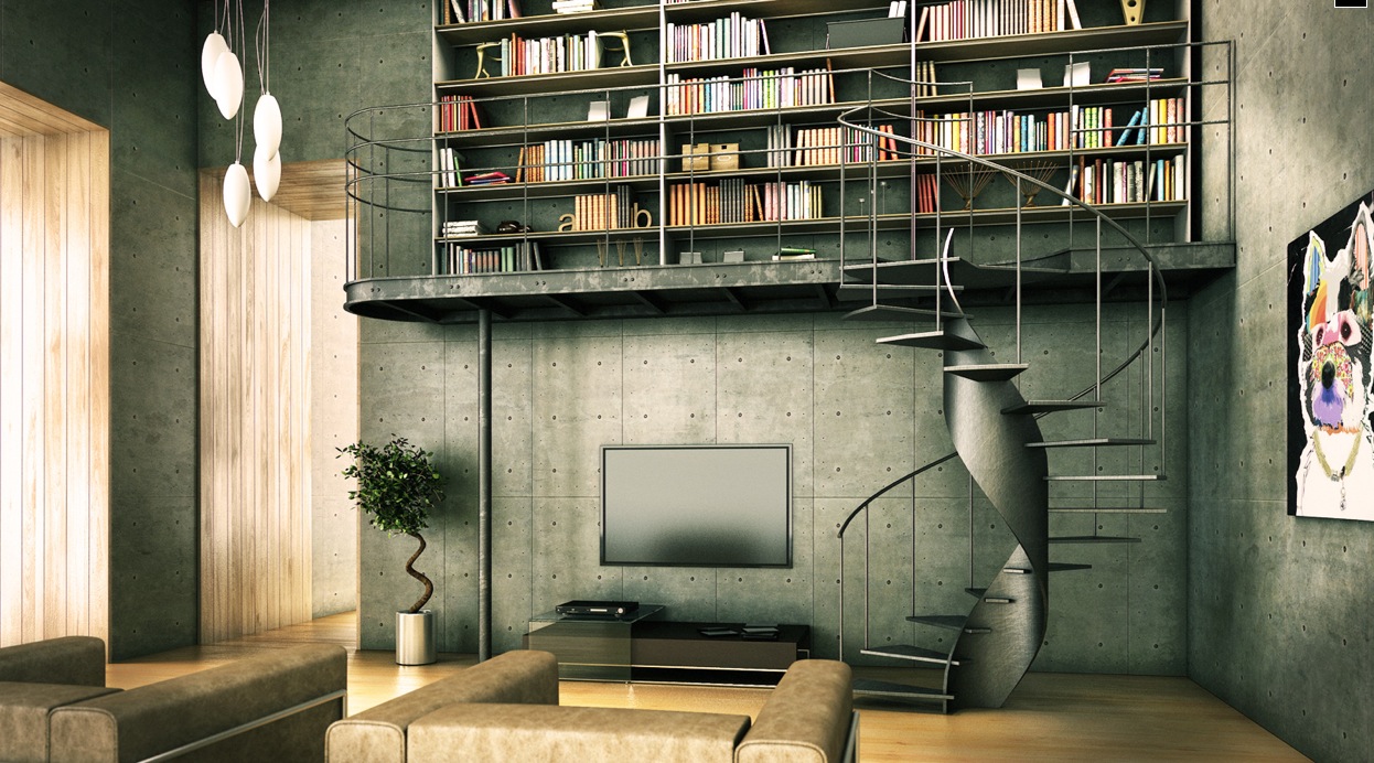
I love this industrial modern approach to tackling the book storage situation. Again, the concept is applicable to many different design styles, but it does have certain architectural requirements. This wouldn't be something that could be an afterthought in most homes.
Here is something a little more practical for an existing space. Either building the shelves onto the wall or using a bookcase to create a small library area in an open floor plan can give you convenience and style, as well as a little retreat in your own home.

If you are dealing with small spaces and want to keep the place looking open, build the book case into or onto the wall. Leave the floor area clear.
 ]
]
Choose your library look when you are choosing your fixtures. Don't go into half heartedly and hope you find something that will work. Have a plan and work from there - what you are looking for can be found. Happy Designing!

I love the bookcase built around a fireplace look, it reminds me of Disney's "Beauty and the Beast" in that the focus of the room is dominated by one wall. I think it lends itself well the many different design styles.

I love this industrial modern approach to tackling the book storage situation. Again, the concept is applicable to many different design styles, but it does have certain architectural requirements. This wouldn't be something that could be an afterthought in most homes.
Here is something a little more practical for an existing space. Either building the shelves onto the wall or using a bookcase to create a small library area in an open floor plan can give you convenience and style, as well as a little retreat in your own home.
If you are dealing with small spaces and want to keep the place looking open, build the book case into or onto the wall. Leave the floor area clear.
]Choose your library look when you are choosing your fixtures. Don't go into half heartedly and hope you find something that will work. Have a plan and work from there - what you are looking for can be found. Happy Designing!

18 Kowloon East

I came across this amazing building that has been built in Hong Kong, it was just completed last year. The project is a 28-story mixed-use building housing offices, retail spaces and a carpark. A design with efficient office floor plates and a rational box were requested by the client - what I love about this building is the innovative way it incorporates an efficient office floor plan with some out of the box thinking to address the air quality in the area.
Kowloon Bay, once dependent on manufacturing, is undergoing transformation of rejuvenation. With the building located in a community with dense industrial blocks, the design investigates the possibility of providing an environmentally sustainable design an incredibly industrial area. The target is to contribute a greening effect to the neighborhood and enhance the quality of life for users in the building, as well as accommodating pedestrians at street level.
With "green" as the theme, the final design introduces extensive planting at the car park floors located at the lower portion of the tower. The building looks amazing but the visually greening effect to the neighborhood is not the only purpose for the gardens, the planting also filters the air and improves the air quality within the car park.
Sunday, September 11, 2011
20 Ways to Decorate a Wall
I absolutely love when I look at a wall and think, "yeah, that is just like (insert your name here). I love to see the character of a person reflected in the design on their home. Whether the walls be busy or stark naked it shows a lot about that person. So, instead of listing out general tips, I found the following list inspirations and design ideas.
My one tip is start with the largest!
This one is from homehints.com on decorating walls with images. I like their bit of advice on putting your largest object that you are going to hang first (as well as mapping out your composition on the floor, starting with the largest object first) and then working from there on placing the smaller ones. Then they suggest that once you get it all outlined use rub-off chalk to mark the top and side positions on the wall. This should keep your wall from looking like holey cheese.

Now to the rest.....


There are many different ways to do it... What was your favorite?
Happy designing!
This one is from homehints.com on decorating walls with images. I like their bit of advice on putting your largest object that you are going to hang first (as well as mapping out your composition on the floor, starting with the largest object first) and then working from there on placing the smaller ones. Then they suggest that once you get it all outlined use rub-off chalk to mark the top and side positions on the wall. This should keep your wall from looking like holey cheese.
Now to the rest.....
Using a frame to "hang" photos/drawings. I like the idea of being able to swap out the images, I also like the depth this gives the wall
Nice use of color and pattern on the plates.
Decorating a wall with stencils
The good idea of this is to use uneven numbered objects to hang on the wall rather than using even numbered objects. It just looks better...
I didn't think that I liked plates, but apparently in some cases I do. Try using plates that you like and hang them in an abtract pattern to liven up your walls.
Love how the leaf patters on the plates match with the pattern of the room and this lodge/wood type furniture.
It's not too clear, but the hanging lamp also matches the pater on the wall somewhat. Nice touch.
A wall of mirrors, but not a wall mirror... excellent
A framed wall mirror blends in nicely with the ceiling moldings... I like the design but don't agree to much about having mirrors in the bedroom...
See the odd number of framed mirrors on the wall? The frames match nicely to the rough wall background, has a rustic/aged look to it..
It looks like wall designs incorporate curtains and windows and lighting. The wall dressed up will give the room more focus and definition.
Shelving can be used to place objects of decoration and functional to create more "space". Again, notice the odd number of shelves.
A more mediterranean design in using iron shelves rather than wood.
Now this is a true space saver wall design idea.. Good modern contemporary touch.
I really like the use of small pictures here to create a single composition. I might like to see it taken a little farther, but part of me says too much.
The stencil and framed wall design..
This one uses a little bit of everything, shelves, picture frames, a bronze
plate... it seems a little busy to me but the point is... don't be afraid to go bold what matters is if you like it.
Using paint in creative ways along with matching picture frames adds a nice touch to a room..
If you have something to say, then put it on the wall... so everyone can read it? There are many other types of designs, the right words in the right color can look very nice.
There are many different ways to do it... What was your favorite?
Happy designing!
Subscribe to:
Comments (Atom)