Monday, September 5, 2011

Baby's Nursery

Since both my sisters have had babies in the past two months I thought it might be appropriate to consider the baby's room.
A baby's nursery is a special place for a new baby and a new mom, especially in the first few months. It should be comfortable and provide for sleeping and storage for the new arrival.
Baby Nursery Ideas
Furniture that can serve multiple functions will work best in baby nurseries, such as a convertible crib that become a single bed and a chest that can serve as a changing table until it is no longer needed would be good furniture choices. Choose furniture that will not be out grown quickly.  A rocking chair or glider is a must!
When decorating baby nurseries use soothing colors, typically the nursery is painted in soft colors but bolder colors in small amounts can also be used.
Mom suit yourself when choosing nursery themes, this in probably the only time in your child's life that you would be able to do so. As your child grows, he or she will have likes and dislikes and will want say into what goes into his or her room.
With this in mind, make sure that the nursery theme and decor is easily changed. Children's interests are fickle.
Here are some rooms that I absolutely love. In all of these pictures the walls are painted to adapt to baby growing up. If you are interested in applying a more whimsical color to the walls, be prepared to repaint.


Note that the gender specific additions to this adorable room are also easily removed. Another thing that makes this room great is that even though it is a nursery, the accessories will work well for different ages If there was a bed instead of a crib this would be a very cute room for a young girl.

I love the sophistication that is brought to this nursery room. I also think that it would work well for a boy or girl. Again, the color scheme will work for years.
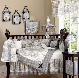

As I said earlier, a nursery is your chance to decorate your child's room. You will never get this chance again so make it a reflection of you. I don't know that all the white is practical, but I like the sentiment.

This one is just the more princess-y of all the rooms that I have looked at. It's elegant but not sappy and over the top. I love that it is a princess nursery without the pink. The furniture and fixtures are very feminine.

Friday, August 19, 2011

Feng Shui Colors

Feng Shui and color

One of the easiest ways of creating harmony and balance in your apartment is by adding color. This is also one of the most rewarding Feng Shui adjustments you can make.
Feng Shui practitioners believe that all colors can affect Ch'i energy differently as the energy in the colour ‘speaks’ and helps to connect the mind, body and spirit.
With Feng Shui you should decorate your dining room, living and kitchen areas in warm colours from the red/yellow side of the spectrum and neutrals are preferred for hall and entryways. The cool colours from the blue/violet side are used in the bedrooms and bathrooms.

White

Blends all the colours of light and represents truth, harmony, purity and the way to higher spiritual knowledge.

Black

Associated with mystery and the unknown. When used carefully it can be considered powerful and dramatic but in excess it soaks up energy and vitality.

Red

Denotes vitality and energy and is associated with joy, strength, love and motivation.

Pink

Offers a sense of spiritual completeness and contentment and promotes healing.

Orange

A happy colour that inspires hope, confidence and enthusiasm. It also stimulates creativity and nurtures ambition.

Yellow

A mood-lifter, stimulating joy, optimism and a sense of well-being.

Green

An abundance of nature and is both restful and energising.

Blue

Generates harmony, hope, calm and stimulates creativity, communication and spiritual understanding.

Purple

Associated with intuition, dignity and wisdom. Purple is also considered very soothing and calming and can create the perfect atmosphere for meditation.


Wednesday, June 22, 2011

Picking a Fabric: Installment #1

Fabric is always a little bit tricky. A lot of times a fabric will look wonderful in a swatch but is incredibly busy in a larger quantity. A good rule for these busy patterns is to use them in small amounts. Pillows, upholstered dining chairs and the like are great for the bold stripe and awesome paisley patterns. If you are going bold on a large peice of furniture like a sofa, be careful that you love the pattern because it will be magnified. Bold moves are rewarded in design, but there is also the possiblity of epic failure. Happy designing.

Monday, June 20, 2011

Building on Neutrals

I know I've spent a lot of time talking about accessories, this is why. Accessories are very easy and relatively inexpensive to switch out and get a new look to your room. Accessories allow a room to be trendy if that is your wish, while maintaining some timeless furniture as your central pieces in the room.

Those central pieces: sofas, headboards, walls - can be painted and upholstered in vibrant colors and be beautiful. The question you have to ask yourself is if you will love it enough to keep that style for a very long time. If the answer is yes, than do it. If not, stick with neutrals.

This doesn't mean that your walls have to be white and the sofa is grey and all the wood is oak. What I am saying is let the accessories bring in the color and give the feel you are looking for in the room. If you tire of that look it is easy to switch out pillows, lamp shades, or prints on the wall.
Dining-room-with-built-in-buffet-and-mirrors-which-make-the-room-look-bigger

Sunday, June 19, 2011

It's a Pillow

I love throw pillows, I have way too many of them. So I always notice a good pillow when someone else happens to have one. I really like the bold patterns pillows can bring into a room. When I was redecorating my bedroom I was looking at throw pillows for my bed, and some of them were outrageously expensive. Come on! It's a pillow, I can make that!

For those who are less sewing inclined, I think we are in good company. I found that the solution to my miserly pillow love was already at hand. solid color pillows range from 5.00 to 20.00 depending on what kind of pillow you are looking for, the fabric type and if you are into ruffles, round pillows and other fancy fabric.

Patterned pillows are expensive, but fabric paint is not. Neither are fabric stencils, if you want to make your own stencil that's a little more work but totally doable. I've made stencils and they have turned out great. the other great thing about stencilling fabric is that painting allows for a flexibility that printing does not. I would say make sure to over paint, especially with different colored paints.

The patterns can be as intricate or basic as you like. I really enjoy the look of spencilled Fabric as well. It's a pillow, but how much more fun is it when it is your own!

Wednesday, June 15, 2011

The Ceiling

Traditionally, the ceiling was the decorated part of the room, not just some flat surface that hung over a room. I'm not saying that I don't like a white ceiling. What I am saying is that the ceiling, as well as any crown molding around the upper walls should be given some thought.

The color from the walls veing used on the molding, or spilling the color onto the ceiling can make the room seem taller. This is a great trick in basement rooms where the ceiling height can be 7 feet. I know I always feel like ducking. So while you may not want to paint the entire ceiling. consider part of it.

Conversely, if the ceiling seems too tall, bring the ceiling down the walls just a bit, or create an attic on the walls (a part of the upper wall that is decorated separately from the rest of the wall and ceiling). It will help fill the room.

Friday, June 10, 2011

Color Palettes

Before I dive into color schemes I need to get a couple of terms clear. I'll use them and if they are not clear, than not much else will make sense.
  • The hue of a color is the basic color. For example, blue is the hue in light blue and dark blue. 
  • Tone describes the color's density and reflective quality. Tone is important when choosing a color scheme.
  • The value of a color describes the amount of white or black in the color. The value ranges from light to dark on a gray scale.
  •  The saturation of a color refers to its pureness and boldness.
Different colors affect our moods in different ways. Before you decide on emerald green, buy five gallons of emerald green paint, consider the effect it will have on the appearance and mood of the room. It's not that you can't use emerald green, but remember our previous discussions - is the room large, because a small room will probably not be able to support the dark color. The room will always feel cold and soothing, is that the feel you want? If your room and decor support that -- go for the green.

If the room is too small or you are not quite set on the foresty look for your room, but still want to incorporate emerald green, accessorize in green, paint in neutral or consider the following:

A color scheme is any set of colors that work together to create a visually appealing layout. The following are suggested combinations, but the possible combinations are limitless.


Complementary Colors

Complementary colors are located opposite each other on the color wheel; for example - red and green, yellow and violet. Each color brings out the richness in the other. When using complementary colors, one color should be subtle and the other color should be more dominant. For example, an intense, dark violet should be paired with a medium to light yellow.Split Complementary Colors


Split Complementary Colors


Split complementary colors offer a wild and daring color palette. Select a main color. Next, find the complementary color and select colors from each side of the complementary color. These colors are excellent for using when layering a faux finish.
Related Colors

Related Colors


Related colors are located next to each other on the color wheel. These colors produce a less contrasting effect than complementary colors. For example, a dark blue-green combined with a light blue can give the feeling of floating in a blue lagoon.


Monochromatic Colors

Monochromatic Colors


Monochromatic colors are colors with the same hue but different tones, values and saturation. For example, a paint swatch card has several different values of one color. Using two or more monochromatic colors creates a stylish and pleasant look.

There are more color schemes to be considered but this is a good start. Remember to consider Values Tones and Saturation when bringing a color scheme together. They do not have to be the same, but it is important that they match. Happy Designing!